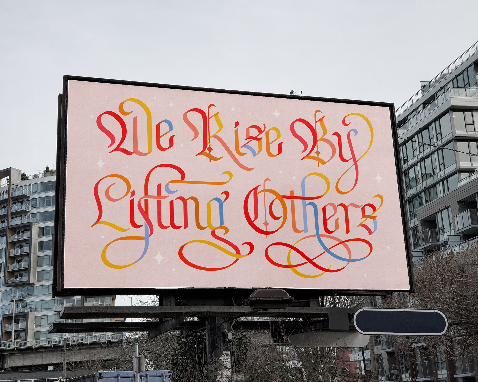
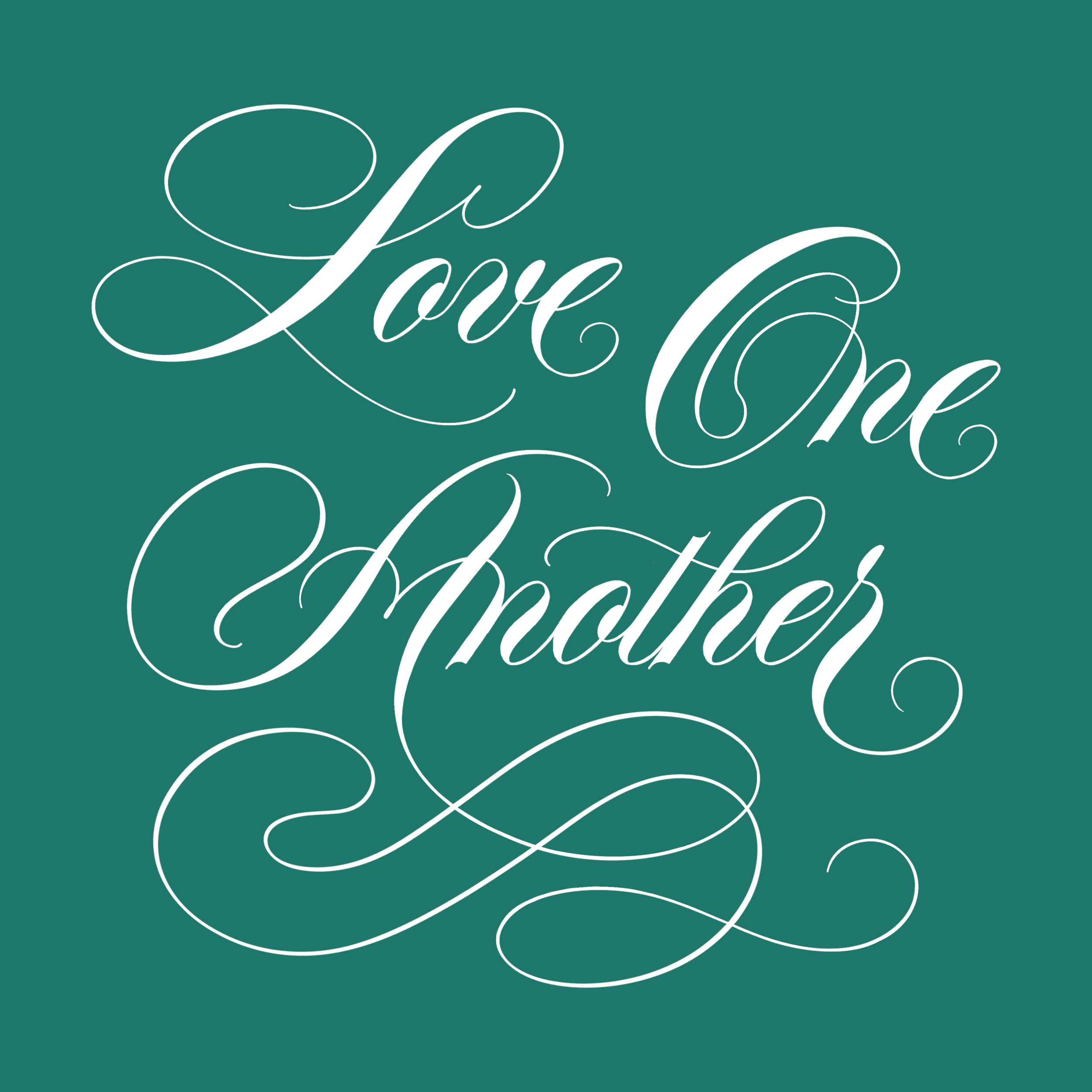
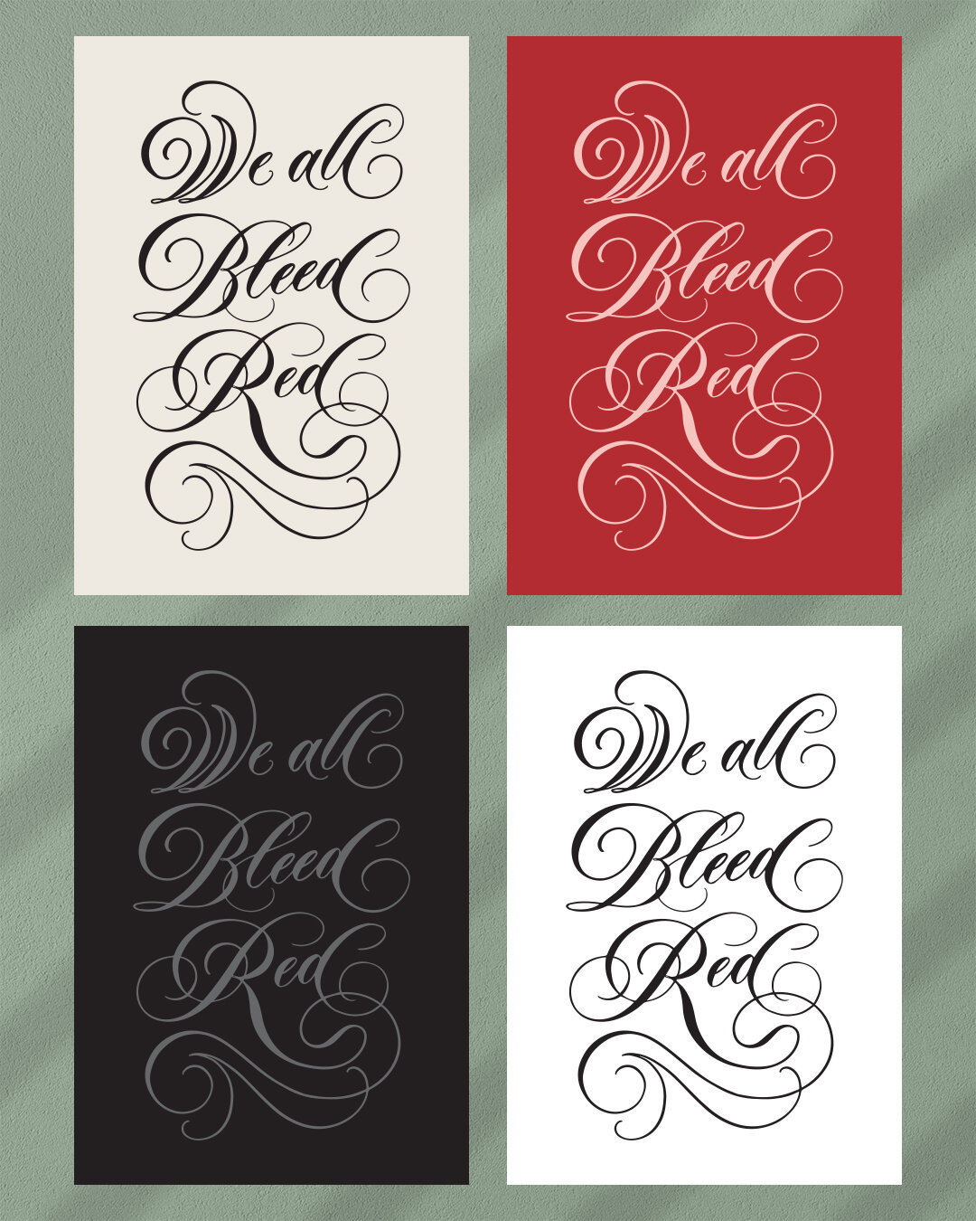
Wouldn’t this look cool in the neighbourhood? Can’t help myself from mocking my art up on a billboard! ❤️
I’m reminded by something I’ve heard on @garyvee‘s video before, and he said: “There are two ways to build the biggest building in town: 1. Build the biggest building in town 2. Tear down all the other buildings around you.”
Many years later, this sentiment still stuck with me.
The world is massive, abundant and giving and whilst it’s a natural human instinct to be competitive for survival, I firmly believe that we truly do grow more when we lift each other, instead of tearing each other down.
I’ve had great conversations in the DMs with some of you guys sharing my experience and knowledge in the industry. And sometimes people would say things along the lines of “thank you for sharing, not everyone’s willing to.” Or course students would say “I can’t believe you teach literally everything and give all your secrets away”.
But truly, I’m just passing it on.
As someone who pivoted from accounting w no former art education, I’m thankful for amazing artists, designers and thought leaders in the industry who lead by example, sharing what they know and had learnt, and not gatekeeping. (S/O to @thefuturishere where I learnt the business of design from, @pandrdesignco & @homsweethom on murals and creative marketing, @jessicahische on pricing, and honestly the list goes on and on.)
In 2016, I remembered interviewing a business owner for a project and he mentioned that he stopped teaching workshops as he felt that they’re learning everything from him and it’s threatening his livelihood.
I remembered empathising with him because it’s a real feeling that I too had felt when I first started teaching calligraphy. Over the years, as I practised and discovered more on mastering the craft, slowly I began to lose this selfish thought and moved from “I’m sharing everything I know but why don’t I feel happy about it?” to “I genuinely want to share and teach everything I know!”.
It feels good to give, and honestly, life is so short. But also, this is not to say you shouldn’t keep to personal healthy boundaries. Share what you’re comfortable w sharing! Live abundantly ❤️
Live on-site calligraphy event process, insights and tips
I'll be at LANEIGE's ION Orchard store on 27 Aug from 5-8 pm! Customising on their new foundation:
Since it's an upcoming event and I know some of you creative peeps may be keen on doing events in the future, I thought I'd let you in on my process!
---
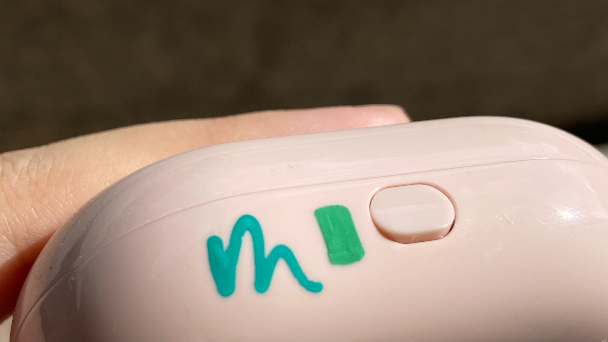
Here are some behind-the-scenes pictures of me testing on their product:
Before a client event, I'd always request for the product item to be sent to me for testing. This helps me to test inks beforehand and ensure that the event will run smoothly as anticipated!
As an artist producing art live, on-the-spot, there's no room for screw-ups and/or guesswork. You're representing not only you yourself as the artist but also the brand who hired you too, so ensuring everything runs perfectly is a minimum requirement.
Other than that, punctuality is a must and customer service and are-you-able-to-handle-potentially-difficult-customers are also great pluses as a live artist!
Producing good work also means 2 things:
Are you able to create good work that both the customer and client are happy with and
Are you able to produce work at a satisfactory pace esp. when there are many waiting in line for your service!
To share, the craziest event I did was at Uniqlo's (linked case study here). One time I had to write 150+ quotes on cards in 4 hours, which was 37.5 quotes per hour. In other words, I had to write 3+ cards every 5 mins (RIP to my right hand).
In hindsight, it was still doable as I think I'm a pretty fast writer but I was also trying hard to maintain the quality despite being fast. If there were more customers in line, perhaps having an additional calligrapher for that event would be really helpful! So another good tip is to ask the client how many customers they're expecting for the event so that both parties expectations are aligned!
Anyway, as you can see - these testing pictures above usually aren't "pretty". There was some back and forth between me and the client when it comes to choosing the exact shade of green and pink that they're looking for! :-) In the end, they chose the soft pink shade as well as the turquoise (more blue-green) shade.
Another tip: if the project scope changes, you can always provide alternative suggestions and be a communicative collaborator instead of scraping the whole project!
Initially, it was supposed to be an engraving event where I'll engrave on the item, but this surface wasn't the most suitable. I then suggested to engrave on the mirror inside the foundation case instead but later on, I learnt from the client that some customers may be sensitive to others touching anything inside the foundation case ie. the cushion. So we had to scratch that idea and change it to custom ink instead.
Hope you enjoyed this blog post! Feel free to leave a comment if you’ve questions and I’ll be sure to get back to you.
P.S. Watch a free class preview from my online calligraphy course!
Create calligraphy art that stands out. Here's how.
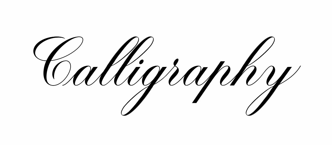
If you were to ask 10 different calligraphers to write 1 word in a traditional calligraphy style such as Copperplate, you'll most likely get 10 script work that looks exactly the same.
Why?
That's because traditional scripts often adhere to a strict set of rules.
Letter form and structure, and corresponding basic strokes and letters are the done the same way.
Copperplate Calligraphy (Base)
Here's how to stand out:
And that's by...
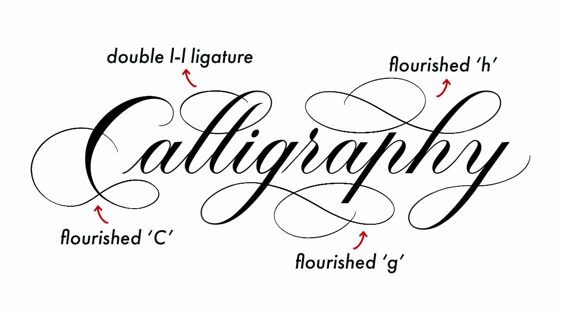
Incorporating new techniques such as creative flourishing and ligatures:
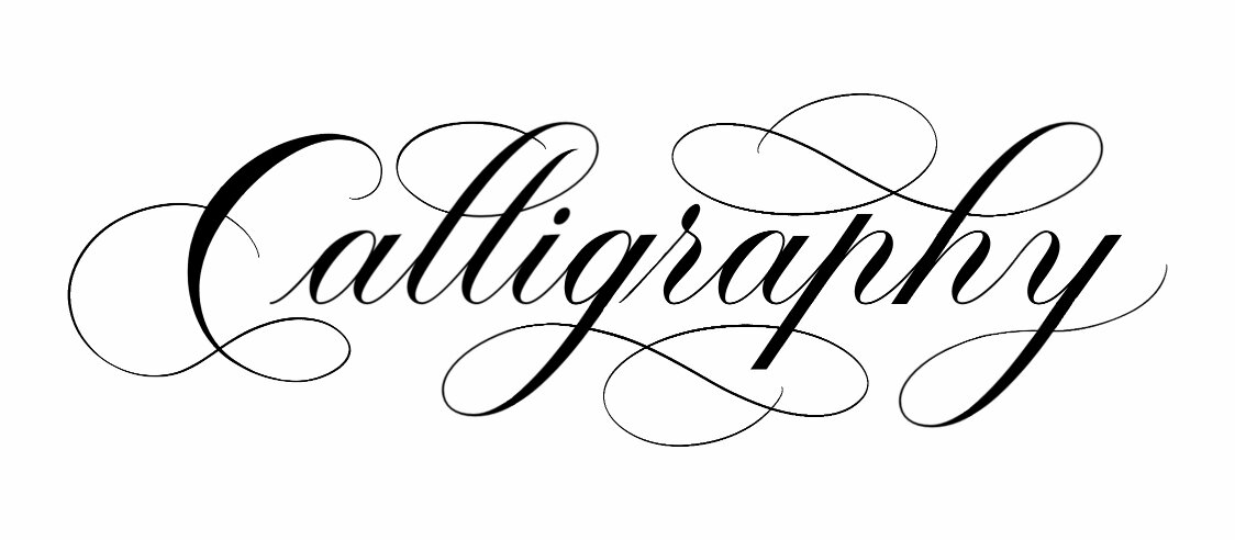
Copperplate Calligraphy (with flourishes and ligatures)
Here's a quick breakdown:
There are SO many different ways to flourish a single letter to create an elegant, ornamental look to your letters.
Take the lowercase letter y for example... here are 7 simple ways to flourish it! But trust me, we can definitely create 10 - 20 more variations, ranging from simple to moderate to super complex ;) Yep, I’m not joking!
Likewise, ligatures (like the double l-l in “Calligraphy”) can really help your work stand out. Not everyone's able to identify harmonious letter relationships between different letters!
But once you understand key calligraphy concepts and most importantly, understand form and structure - you'll definitely be able to train your eyes to...
Identify letter relationships and
Create creative interactions between your letters: this could mean double ligatures, triple ligatures, quadruple ligatures etc.
Or even: combining flourishing with ligatures to produce undeniably mesmerizing results.
Flourishing and ligatures are SO much fun, and it's one of my favourite things about calligraphy. After mastering these, these new skills will help in creating effective compositions and layouts as well.
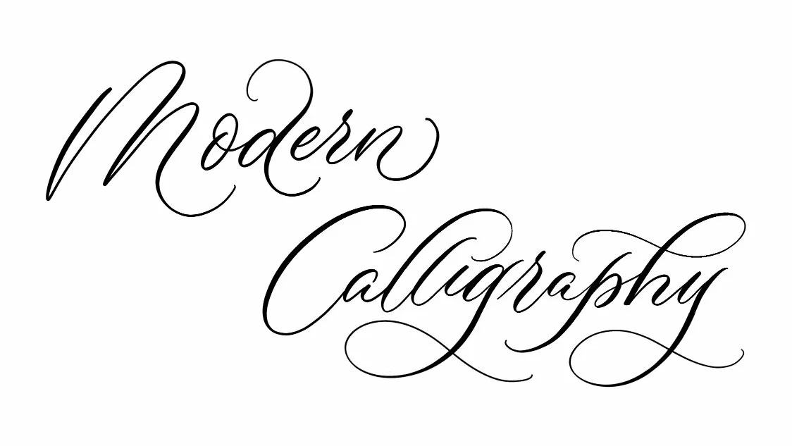
Last but not least... another way to create unique work that stands out is modern calligraphy!
After learning traditional script, we can now break the rules and play with modern calligraphy.
If you were to ask 10 different calligraphers to write 1 word in a modern calligraphy style, you'll most likely get 10 script work that looks fundamentally different and unique.
And that's because there are sooooo many ways to break the rules! The above is just one sample style, but know that you can create so much more.
Let me know if this is helpful. I'd love to know... which do you prefer: traditional or modern calligraphy, and why? Feel free to comment below to share your thoughts with me!
Pssst. Interested to learn more about calligraphy? Check out my online course: The Ultimate Calligraphy Course and watch a free preview lesson today!
Why your calligraphy letters don't look good... and how you can fix it!
Have you ever found yourself saying or thinking these things while writing?
🖋 "Why do my letters look so clumsy and ugly?"
🖋 "How is it so difficult to move my hand to where I want it to?"
🖋 "Can't my upstrokes be thinner?!"
🖋 "Why does calligraphy look easy for other people but not for me?"
🖋 "I don't know what is wrong!"
If so, I say this with so much love but...
You don't need to practise your letters 1,000 times to get it right.
Sometimes the solution isn't "more practice", it's *clarity before execution*.
Remember, train your eyes before you train your hands!
Let me share on one of the most common mistakes that beginners often face: Pressure control.
Rule #1
Calligraphy looks elegant because of *visual contrast* ie. we've thin strokes and we also have thick strokes.
The next natural question you may ask is: "How do I know when to write a thin stroke and when to write a thick stroke?"
Rule #2
Easy!
If you're writing a downstroke, where you're bringing the pen towards you: apply pressure.
If you're writing an upstroke, where you're bringing the pen away from you: release pressure.
If you're saying... "Hold on, Leah, I know this already but my letters still look bad!"
Gotcha!
Rule #3
Should you try a brush pen and not be able to control the upstrokes and downstrokes well, I highly highly highly recommend scaling back to something even more basic: the pencil!
Remember: form always come first. Once your form is good and ready, you can tackle the brush pen next.
Especially if you're someone who's pretty heavy-handed in nature (aka when you write on paper with a pencil, and the pencil marks can be seen on the other side of the paper), then pressure control and grip are things you want to take note of.
So today's action step: try applying heavy and light pressure on the pencil instead of the brush pen.
If you're not sure what this means, feel free to check out this video below. It's only 1 minute so it won't take too much of your time.
Let me know if this is helpful. Feel free to comment below if you've questions!
Pssst. Interested to learn more about calligraphy? Check out my online course: The Ultimate Calligraphy Course and watch a free preview lesson today!
"What calligraphy pen should I buy?!" - Covering *all* the Calligraphy Tools!
Have you ever stood at the stationery aisle and don't know which pen to buy?! Either that or... do you wish you could buy alllll of em?
Now let's take a step back to understand our tools first so we're more clear on what we're actually buying and what these tools can do for us.
Commonly, there are 5 categories of tools you may use for calligraphy:
Brush pens
Water brush or aqua brush
Round brush
Fountain pens
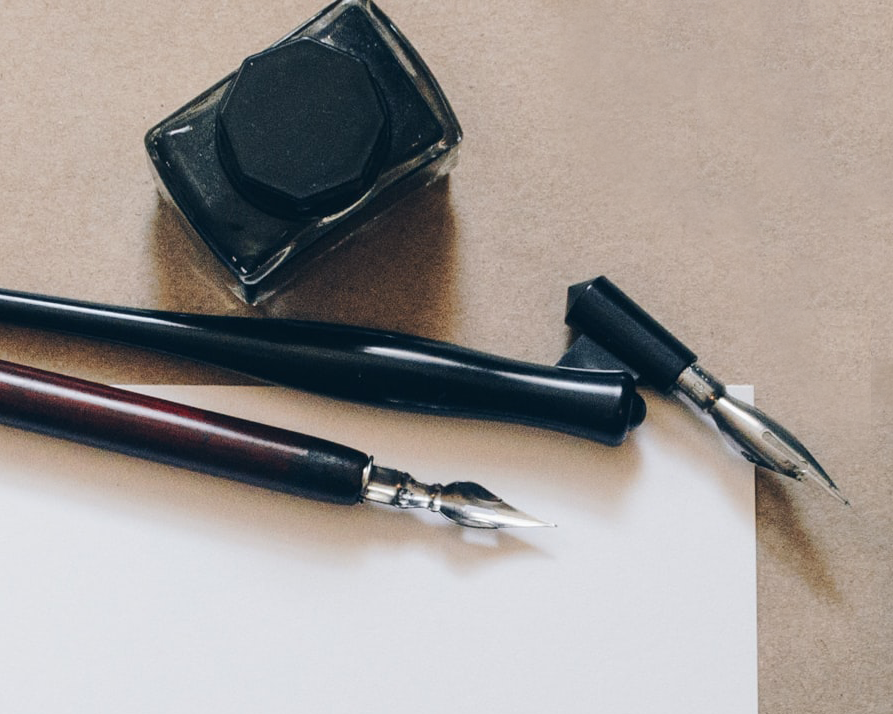
Dip pens or pointed pens
You may have heard of some or all of these before, and while they all can achieve similar results, these tools are not the same! When done right, you can also produce really creative results with each different tool as well.
1. Brush Pens
These are my ABSOLUTE FAVS! If you've ever watched any of my calligraphy videos before on socials, you'd know that 90% of my videos are done using brush pens.
Why?
Simply because these are the easiest tool to use. It's fuss-free because I don't have to deal with any ink dipping or spillage. It's beginner-friendly, durable and very, very forgivable. The only time I've seen it being broken was... one time, I was teaching a private class for super duper young kids and one of em stab the nib right at the table forcefully.
Gone. Nib disappeared. Vanished. Went incognito.
Yep that was the only time.
Other than that, brush pens are nearly perfect for every and any use. You're also able to write fairly quickly with these!
If you're someone who likes to write fast and have no patience to watch ink dry for hours (aka me), this is perfect for you.
2. Water Brush
Water brushes or aqua brushes are the next level up. I often advise my students to try these after they're really comfortable with brush pens.
Why?
That's because water brushes are a lot softer in nature. You'd find these trickier to control. One stroke with tiny pressure can give you a fairly thick stroke on the paper itself.
Pressure control and mastery's key for this tool!
The plus? Colours!
If you're someone who's looking for a specific colour, it's less likely to be found in brush pens. For example, even a gold colour can have various shades: yellow gold, a more bronzy copper shade gold or even a rose gold.
If that's the case for you, I'd recommend opting for a water brush where you can tailor your colour preferences and custom blend your own ink down to the minute details.
Another plus: with the ink enclosed, there's no need to constantly re-dip ink again and again.
P.S. I use water brushes to create coffee ink calligraphy for a live calligraphy event! Click here for the full case study.
3. Round Brush
Next, round brush! This is similar to water brushes. The only difference here is - for water brushes, it's fairly limited to water-based inks. Trying other types of ink may risk clogging.
If you're in the market for brushes to use with acrylic inks, india inks etc., go for the round brush!
Con: you need to constantly dip the brush in ink whenever ink runs out.
4. Fountain Pens
Moving quickly along, we've fountain pens! These can go way luxe and costs up to the thousands (I know!). But essentially, fountain pens each have a metal nib that allows the ink to flow through, and depending on the pressure applied, you're able to create a variation of stroke widths ie. thin strokes and thick strokes.
Plus: no need for constant re-dipping of ink! All's in the cartridge. Fuss-free!
5. Dip Pens / Pointed Pens
Ah, dip pens. Have you tried this before? Was it frustrating?
If you did, you probably know that dip pens or pointed pens require so. much. patience.
And that's because 1. not only is the tool trickier to control, but 2. after writing a few letters or words, you have to re-dip your pen into ink again.
Sometimes, you may even write a quote, and just when you're about to finish writing, the nib catches on the tooth of the paper...
Boom.
Ink splatter everywhere. Artwork is on its way to heaven.
That's why I often recommend students to try brush pen first, followed by water brushes, then round brushes, and lastly, dip pens. Exactly in this email's order! Because there's a whole set of problems to tackle when it comes to dip pens.
🖋 What if the ink doesn't flow out?
🖋 What if the ink splatters all over my paper?
🖋 What if the ink bleeds through the paper?
🖋 How do I prep my nibs?
This is not to discourage you, but the truth is, you can totally master dip pen calligraphy. It just requires 2 things!
Mastering the skill of calligraphy first
And then, mastering the tool itself.
This provides a gentler learning curve and a happier experience.
If you're tearing your hair out, you're probably doing it wrong!
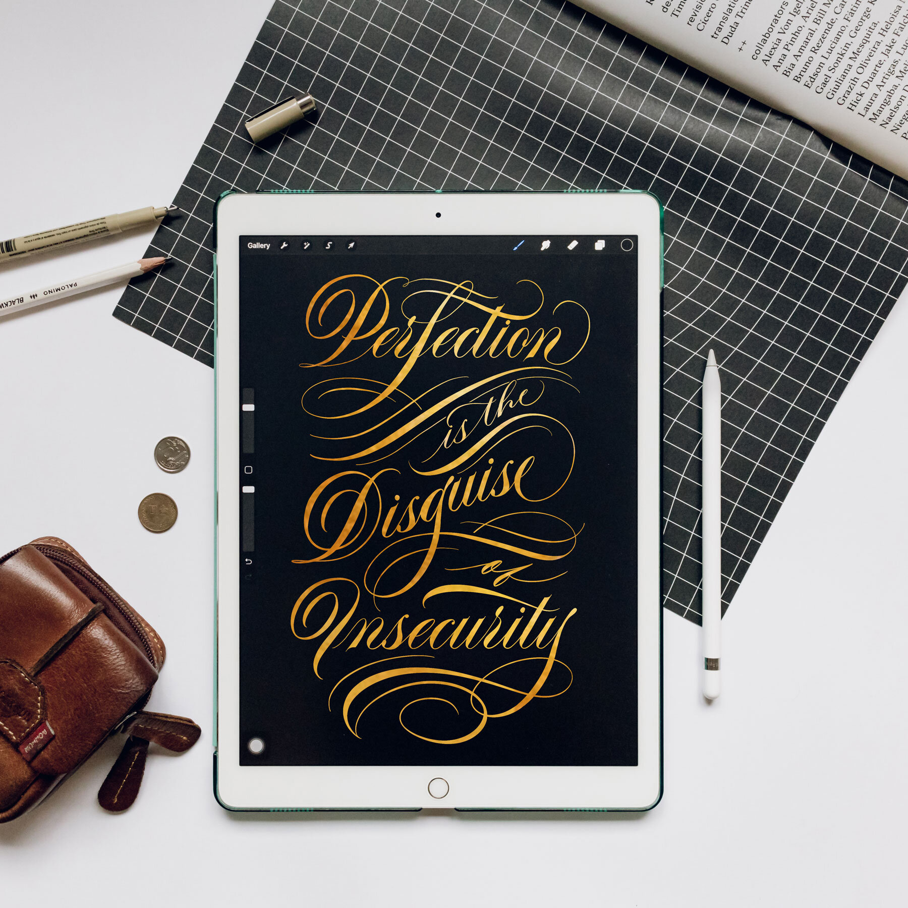
Bonus: Apple Pencil
A quick lil bonus for funsies: Apple pencil.
Well, this tool's probably the most expensive "brush" I've ever bought, but it's well worth it! I've done so many projects with this, not just for calligraphy but also lettering and illustration work.
It also streamlined my process and I feel more productive too!
Personally, I started out learning calligraphy first, then lettering, then illustration. At first, all my work's done pretty much analogue: pen to paper, straightforward and done by hand.
Somewhere in between, I picked up the Apple pencil and don't get me wrong - it's still done by hand. But now I no longer need to scan my paper sketches > digitise them via Photoshop & Illustrator. I can now draw directly on the iPad and skip the intermediary steps.
Here's some of the work I made on the iPad with the Apple pencil:
Case in point: calligraphy is a skill, but the applications are limitless! You can calligraph pen to paper like writing cards for friends or calligraphing your own wedding invites or even explore other avenues such as drawing letters digitally and even animating them. How fun, right?!
Let me know if this is helpful. Feel free to comment below if you've questions!
Pssst. Interested to learn more about calligraphy? Check out my online course: The Ultimate Calligraphy Course and watch a free preview lesson today!

