Become Thyself - Brand Merchandise Design
Client: @whereartjon by Jonathan Lim
Role: Art Direction, Merchandise Design, Lettering, Calligraphy, Typographic Design
The Brief
To create 3 typographic styles of “Become Thyself”
Designs to be used on brand merchandise e.g. embroidered iron-on patches, T-shirts, badges etc.
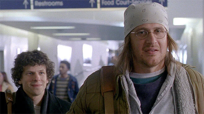
“Become Thyself” is a phrase adapted from “Although Of Course You End Up Becoming Yourself” by David Foster Wallace (DFW), who is also Jonathan’s favourite author. I was asked to consider Jonathan’s aesthetic and style as a painter, and use the ideas presented in the film “The End of the Tour” and the book it was based on, “Although Of Course You End Up Becoming Yourself: A Road Trip with David Foster Wallace” by David Lipsky as inspirational sources for the typographic decisions made.
“The End of the Tour” Film (2015)
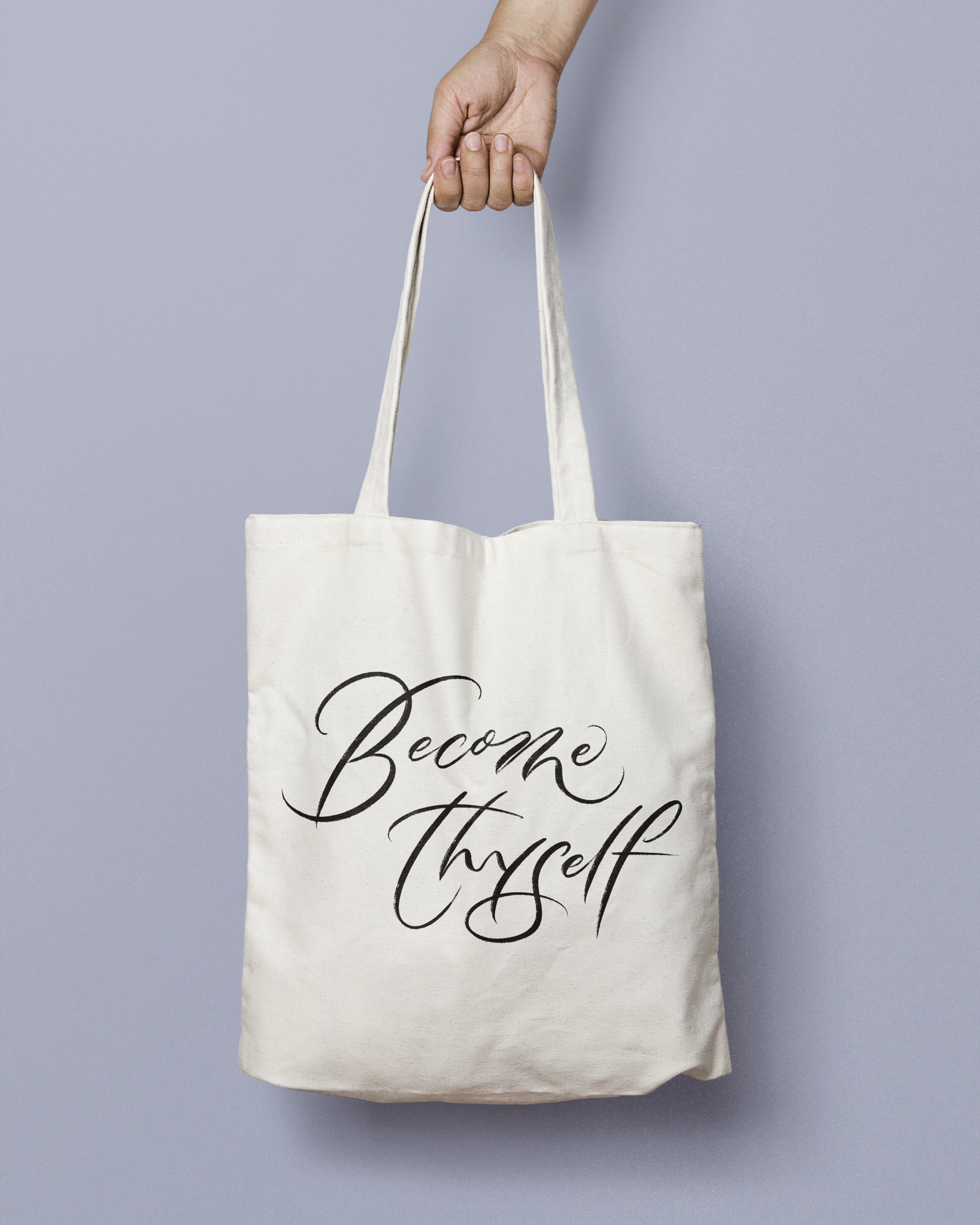
1. Breaking Free
Concept: DFW’s experience with anxiety, loneliness and depression and freedom from these struggles
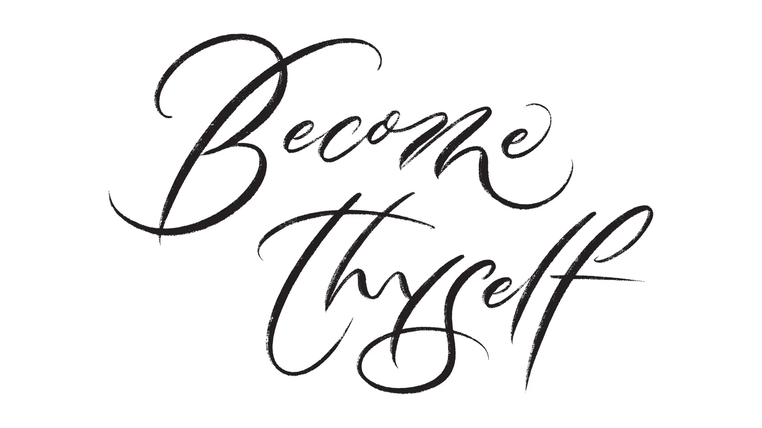
Art direction: Gestural calligraphy
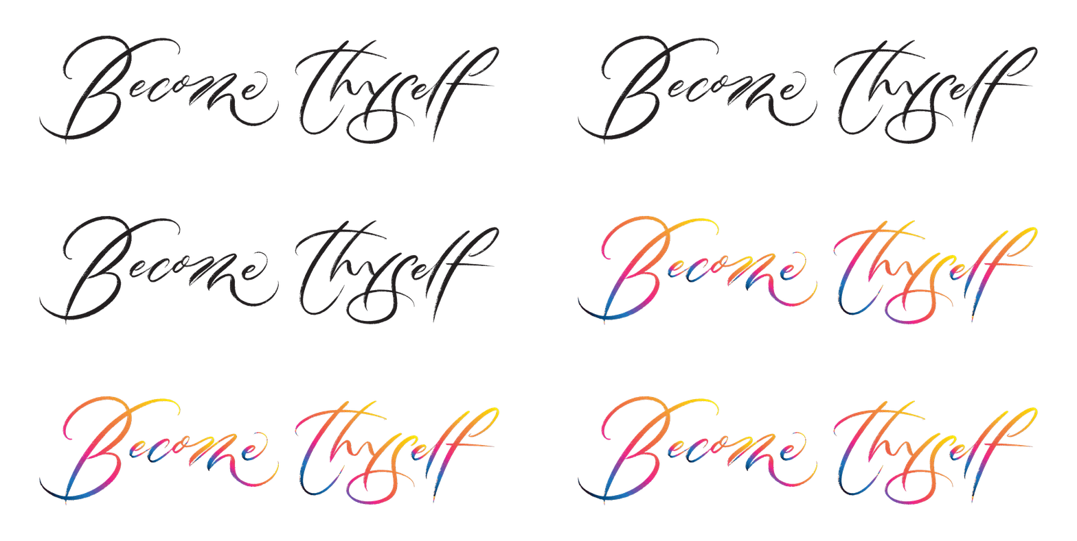
For the first style, I chose to break the rules of traditional calligraphy script, and aimed to balance abstraction with legibility – so that it captures the essence of intentional mark-making and impact of “release/ breaking free”, yet remains readable for effective visual communication. With confident lines, gestural writing and the shapes and beautiful textures that follow through, this helps to convey the dynamic energy and emotive expression I was going for.
VERTICAL LOCKUP
HORIZONTAL LOCKUP ( + SUGGESTED COLOUR VARIATION)
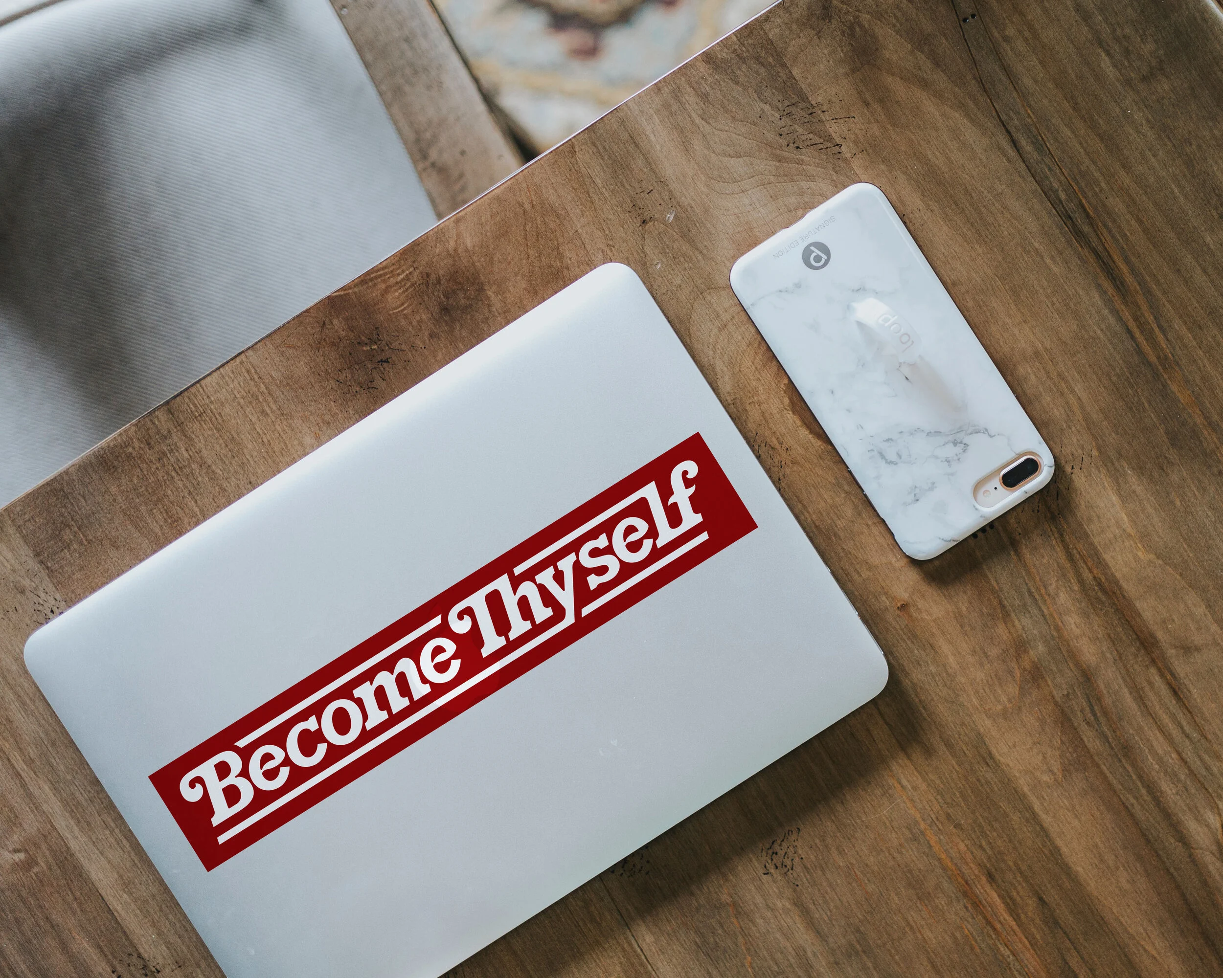
2. Beauty in the Mundane
Concept: Journey of life; the relationship between happiness and boredom i.e. ordinary unhappiness and how to see beauty in the mundane
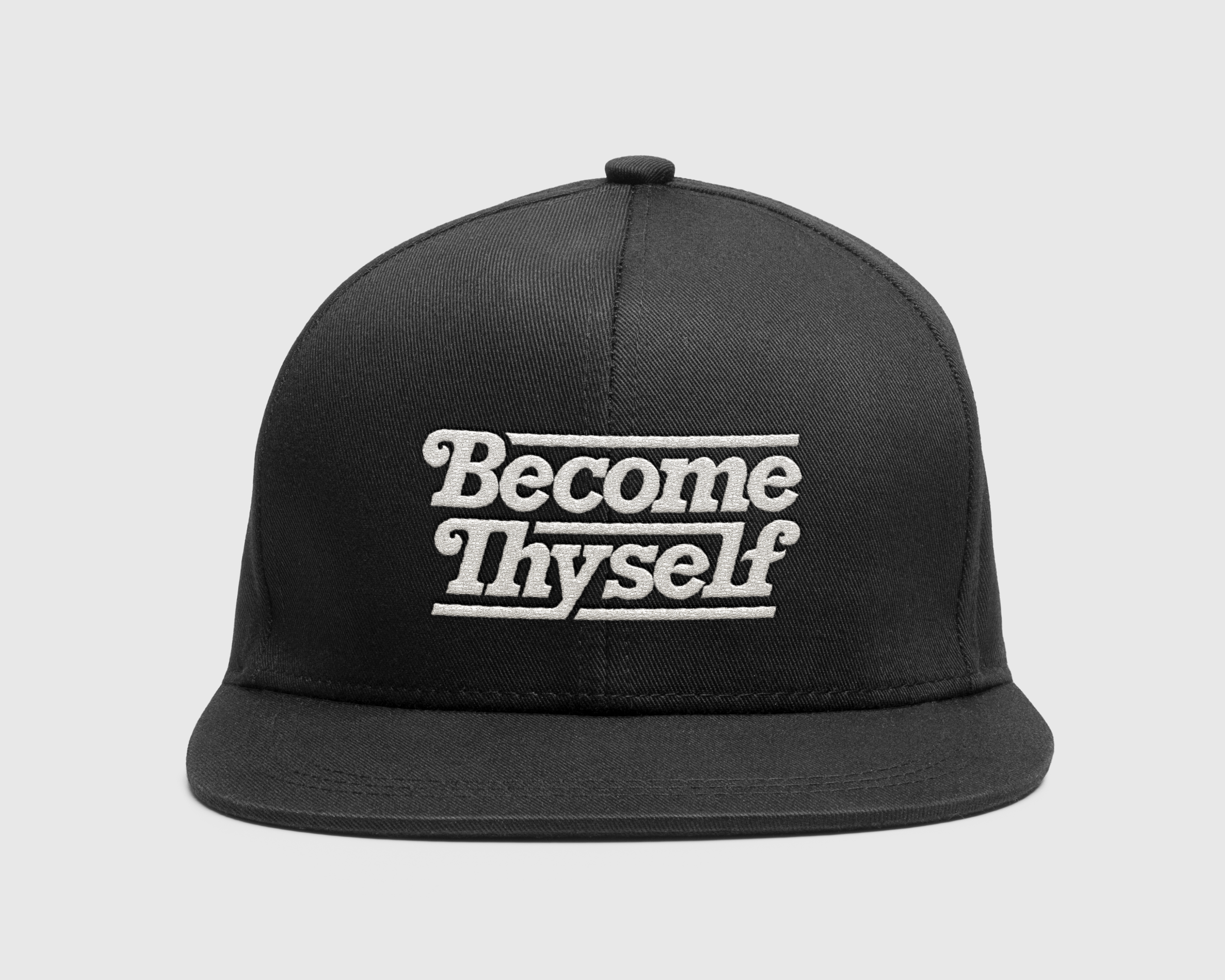
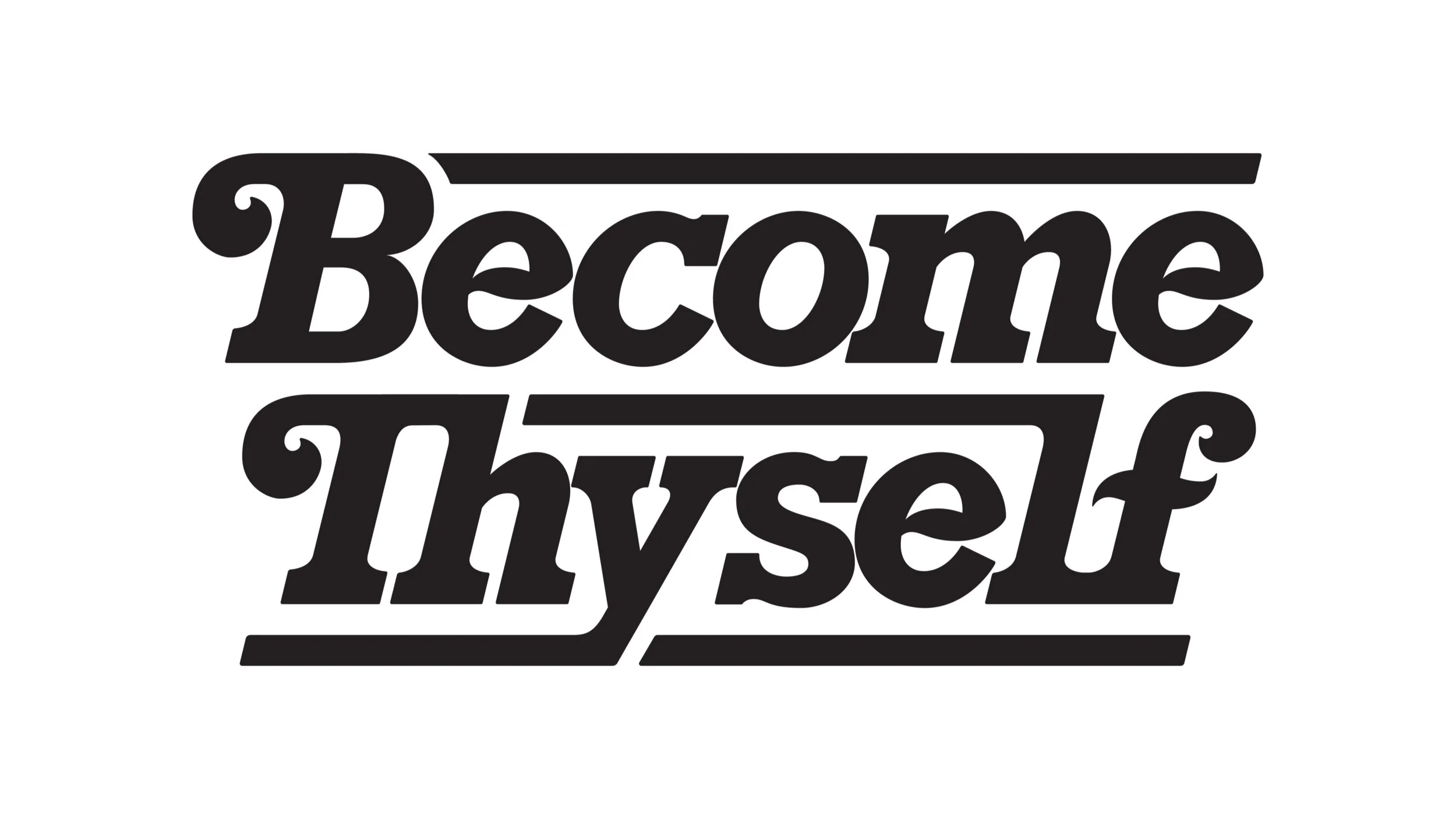
Art direction: Slab serif type; nod towards nostalgia but applicable in a modern setting
Inspired by the film’s DVD title treatment in slab serif and its timeline being set at 1996 (year of encounter between the 2 main characters, DFW and David Lipsky), I followed my curiosity towards chunky letterforms, retro type and type treatments that invoke a sense of nostalgia. The final piece showcases a slab serif type treatment that is bold and attention-grabbing, but scaled back with soft rounded corners, bracketed serifs and minimal contrast. The crossbars of the f and e (unlike the horizontal or sloping ones enclosing the eye of the e) are also drawn as an s-shape stroke to add a softer and custom made appeal. To finish, horizontal leading lines were added to frame the letterforms, adding a sense of grounding and stability.
VERTICAL LOCKUP
HORIZONTAL LOCKUP ( + SUGGESTED VARIATIONS)
3. Introspection
Concept: Self-reflection
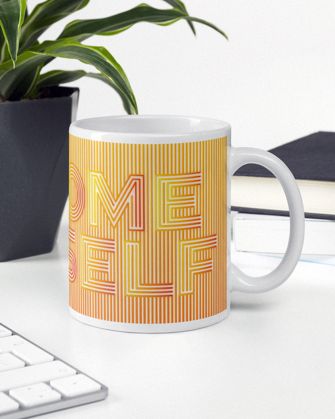
Art direction: Linear monoline type
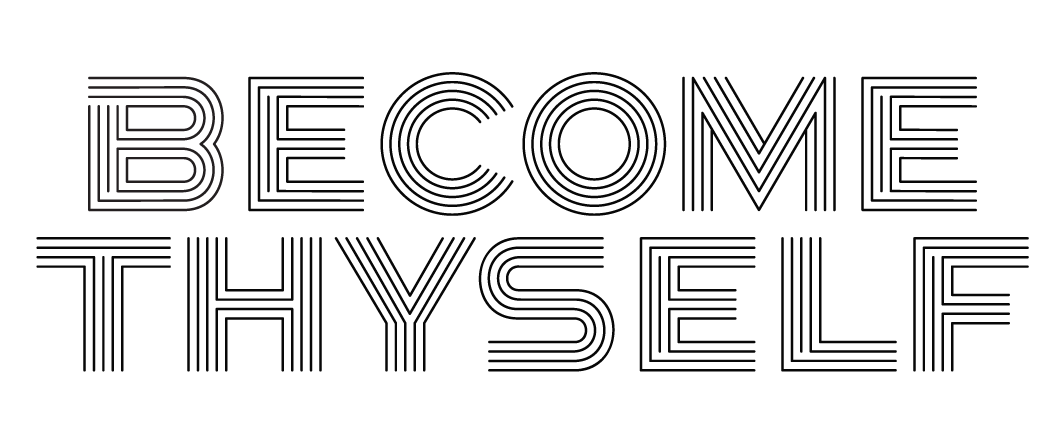
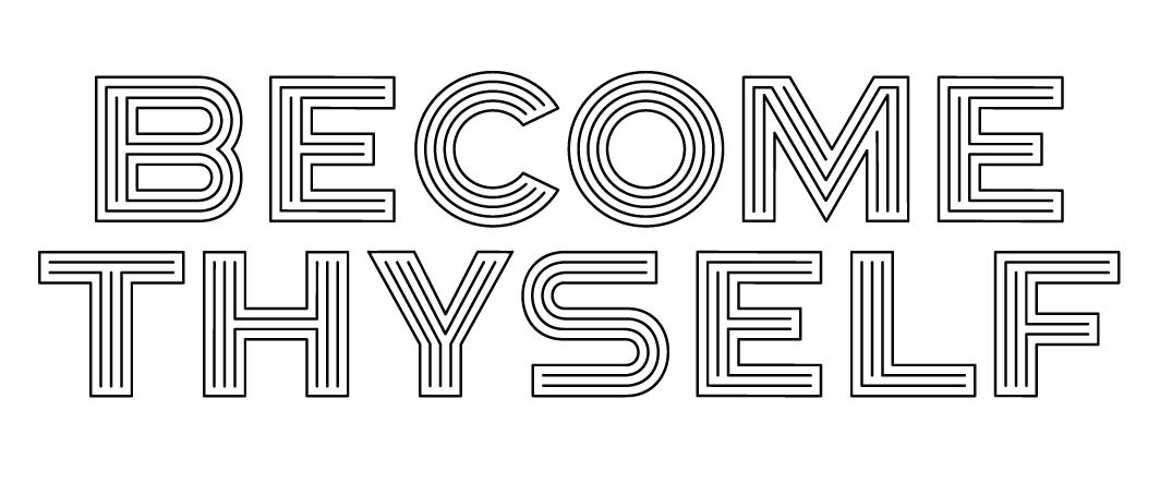
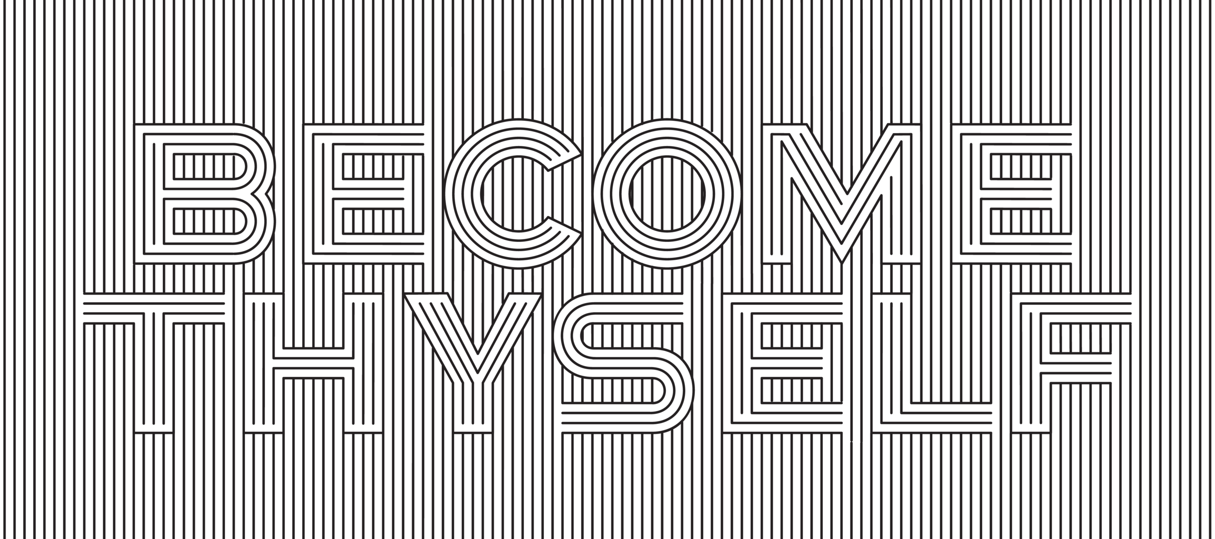
For the last style, I was inspired by a quote by DFW – “If the writer does his job right, what he basically does is remind the reader of how smart the reader is”. Think: one line, connection, parallel lines, same wavelength, aligned perspectives. Some variations I’ve created include: open, closed and masked.
OPEN
CLOSED
MASKED
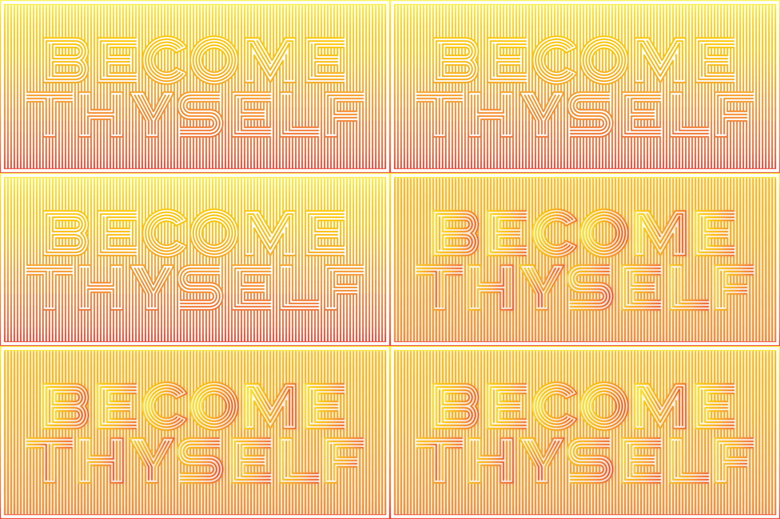
SUGGESTED COLOUR GRADIENT VARIATIONS
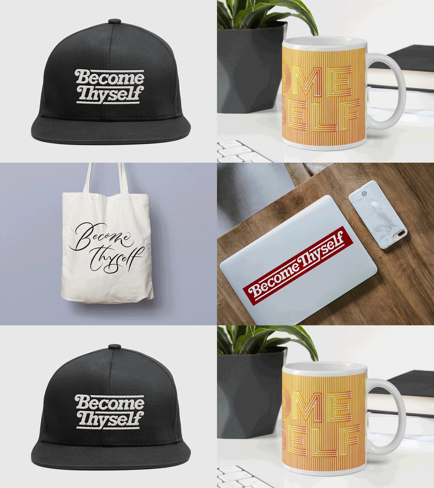
Mock Ups
*Note: these images are not actual products, but mocked up for the Client to easily visualise how the designs can be used on various type of items.
Client Testimonial
“Leah’s aesthetic versatility, conceptual thinking, and her balance of a systematic approach with poised emotive expression in typographic construction is something I’d highly recommend. Very pleased with the elegant solutions she crafted for me.”

